Brief:
I am required to re-design a website for the band Groovecity who are a party band for hire based in the midlands. The website will need to be easy to navigate with a clear layout that is simple yet engaging. The target audience will be clients looking to hire the band as well as the fan base that follow the band. This means it will need information regarding up and coming gig dates, a bio about the band, a gallery, some audio and video samples, contact details, and links to social media.
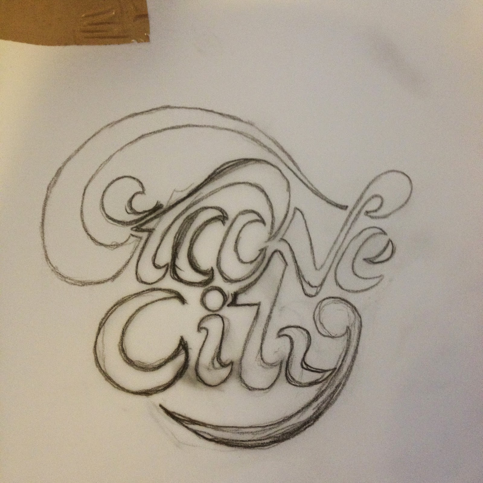
Logo Development
I want to have ago at creating a hand made logo for the band as I think it suits the music. I don't usually draw logos by hand so this will be a challenge.
I found I was happy with the 'groove' part of the logo but I struggled to draw the 'city' part. I want it too look well balanced.
I experimented with some different variations but I think I am happy with the design above. I will make some adjustments once its been digitised as I am struggling to improve it with my drawing skills.
Digital Development
First thing I needed to do was to draw round the design with pen tool.
Once I had finished tracing the design I filled it with black, this made it much easier to see what needed to be adjusted to improve it.
The first thing that stood out to me was the inconsistent thickness of the better forms so I widened the strokes to give a fuller appearance.
I wanted to test what it would look like on one line. Im not sure if it works, this is something I can ask in a crit.
There was something still bothering me with he design so I tried enlarging the 'city' part to make it more in proportion with the top, this has made a difference as I now think it has balance.
Here I tried a 3d extrude effect with two colour. I don't like the 3d effect but the use of two colours with a thick online acting as a background could work.
Next I tried using a brush on the online of the logo with a thick stroke. I think this works well but the right colour choice will be necessary for it to look right. It kind of reminds me of the body of a bass guitar as well which is something I could play with later on.
Colour Experiments
After testing out different colour combinations I have found that two colours that are similar in hue but one dark and one light shade works best. This is something else I need to ask in a crit.
After some reflection Im not happy with the logo so I want to try again with a different approach.
Grid System
I have created a simple grid to help me keep the letters consistent.
After creating the letterforms I think I am going to leave them out and use just the first two letters of each word to make a stand alone logo because the letters link together well.
I tried adding detail inside of the forms to make it stand out more. This will give me the option to introduce some colours as well.
Final Logo Design
R -25
G -145
B -189
R -224
G -74
B -49
After some refinement I am happy with the logo. I decided to fill in the forms with solid colour to give it more clarity, especially if I use a coloured background on the site.
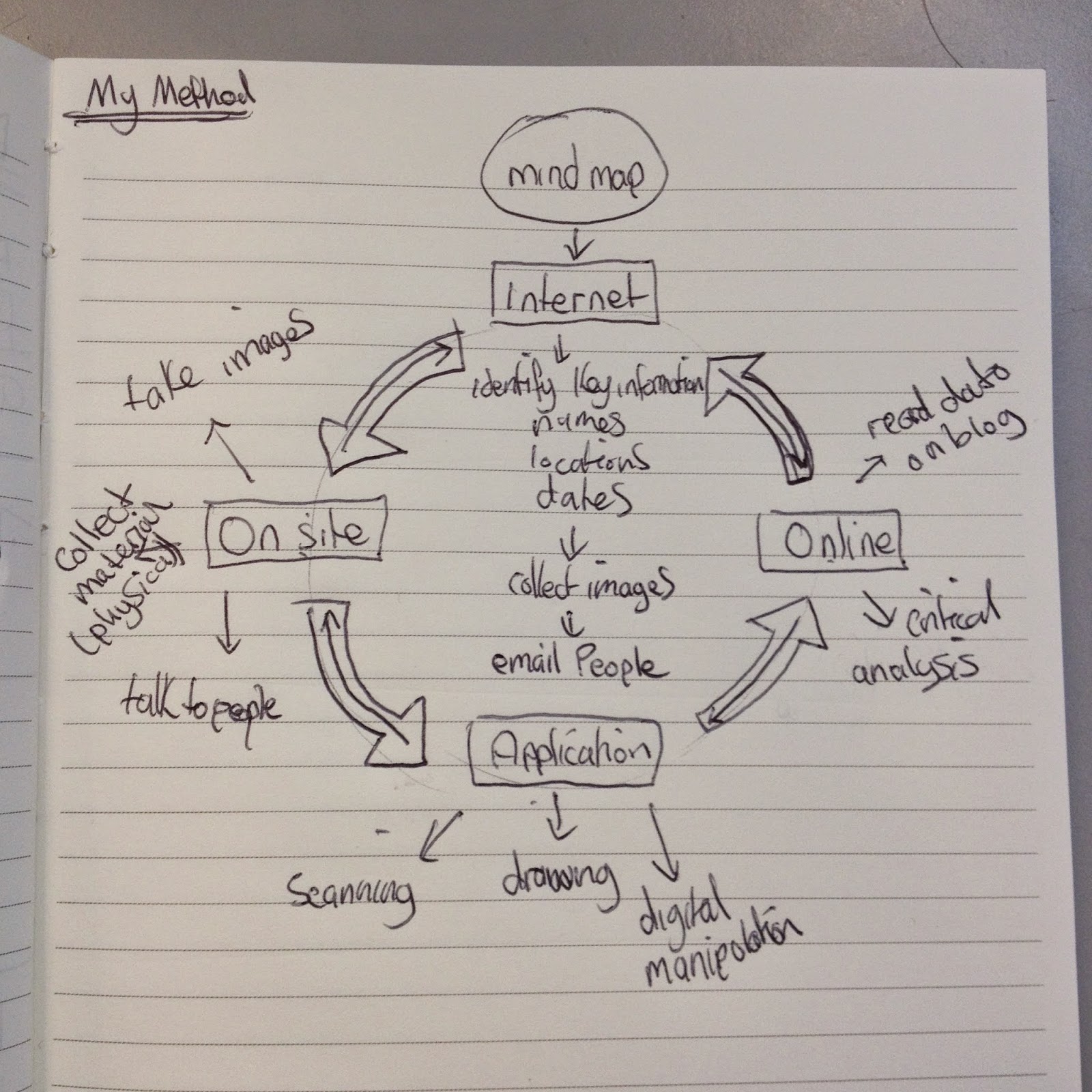
Website Development
I began by planning the structure of the website. I think four links will be needed to make the page functional and clear to use. I have drawn some thumbnails of the homepage to help me get started and once I am happy with the homepage this will be the template for the other pages that I will construct and experiment digitally.
Fonts:
Bebas Neue (Links)
Nexa Light (Bodycopy)
I created a 10 column grid, this should give me plenty of layout options.
I have used a full bleed image of the band for background. The image quality wasn't the best so to avoid pixelation I have changed he threshold.
Background colour:
R -247
G -186
B -42
I created an angle of darker colour to give some contrast and follow the angle in the logo.
Because of the space left to the left of the 'C' I think its best positioned in the center of the page. The social media links will need to be on every page.
I have used a home link, gallery, media, and contact.
Instead of having an events page I decided to have the gig dates on the hompage as this will be the first thing people see. It also gives the homepage a purpose instead of just being a landing page.
I have added some plus and minus buttons for navigation. I have the social media links at the bottom as well for further reinforcement, these will be on every page.
I have made the 'get in touch' type in bold so it can be clicked which will take you to the contact page.
Roll-over Buttons
I have made some examples of how the rollover buttons will work so it clear to the user what can be pressed...When the date buttons are pressed it pops up with the venue and the location.
About Page
I decided to change the homepage to about because the logo will act as a link to the homepage.
I have made the information word in bold and underlined to work the same as the word on the homepage, this will take you to the contact page when clicked.
Crit
I have applied some of the suggestions made in the crit. One suggestion was to include the year above the gig dates. I originally had social network links at the top and bottom of the page but it was suggested that one set would be sufficient, so I have changed it so they are just at the top. It was also suggested to have the full band name somewhere near the logo to make it clear. I haven't changed this yet but I will be testing it out to see if it works. It was also suggested to make the links move to the top of the page so they are always visible when scrolling. This is a good point but it may not be an issue as the pages will not be that long. The final comment was to have a submission section on the contact page. I was already thinking of doing this so its good to know other people think the same. I was asked if I am going to make the design responsive, I wasn't going to but I think it will be a good idea to as most websites nowadays are responsive.
Gallery Page
I have decided to use images on the gallery page in a tile style design to work with the grid.
Because of the length of the page I have taken on board what was suggested in the crit and have designed the links and logo section to have a fixed section.
When the user scrolls down the page the links section appears and the images scroll up underneath it like in the example below.
I have included some arrows next to the images so the it makes the function clear to the user.
I have made a pop up window that will appear when an image is clicked. There is the option to scroll through the photos and to exit the window in the left hand corner.
Media Page
For the media page I have created a drop down menu to categorise the page into audio and video. The roll-over examples are below.
For the audio page I want to have a cassette that plays the music. This will be done by pressing the play button and to skip songs the arrows.
In the bottom right corner I have included social media button so the track can be easily shared.
I experimented with different colours and textures but I don't think it works with the over all page design. I think this might be because the logo is really vectorised so I have decided to use an image instead for contrast.
I changed the threshold of the image in photoshop first then placed it in illustrator.
To make the control button stand out I have used the logo colours for continuity.
Audio Page
Video Page
The video page uses the same format as the gallery pop up window apart from the video is embedded in the page.
Contact Page
On the contact page I have mimicked the design on the homepage by using similar roll-over buttons with icons to show the contact information.