I will be collaborating with Dan Everitt on this brief.
The Brief:
Brand Guidlines:
Main points:
.Use specified logo colours, and primary and secondary colours
.Logo clear space
Concept Development:
The main points we took from the brief were playfulness and creativity. They basically want something fun and engaging that will engage the audience.
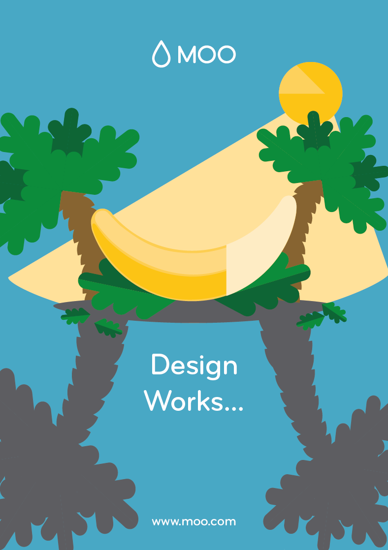
We were discussing ideas and came up with the idea of creating a poster series that would work separately and together when layered up. We were thinking of things from nature that have evolved design to best suit its purpose. All so we have taken the brands strap line and separated it into three. So the posters will follow as: design, design works, design works wonders.
The best idea we came up with and would work work across posters in three stages was a banana. The idea is a banana on its own on the first poster to show the design of the fruit. The second poster would be the banana half peeled to represent 'design works' and the third would be a banana chopped up in an ice-cream sunday that would have the heading 'design works wonders'. The banana won't change position so it will allow us to layer up the posters.
I have bought a selection of coloured card for us to use when making the image. They will be laser cut once we have designed the posters.
Poster Development:
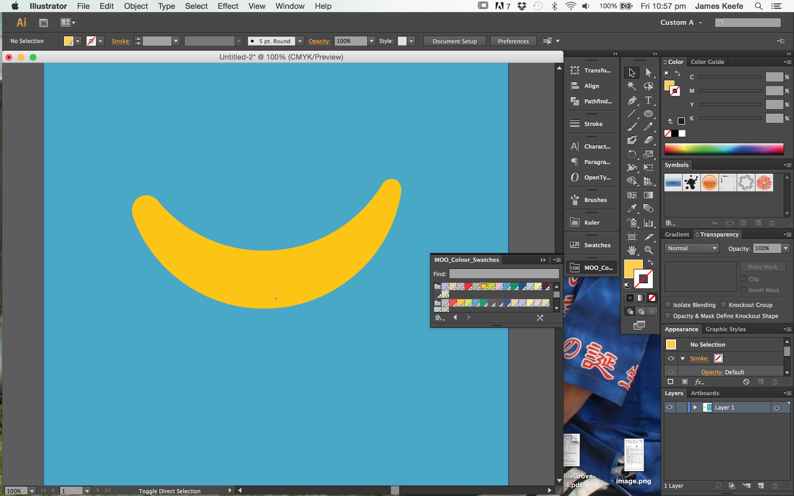
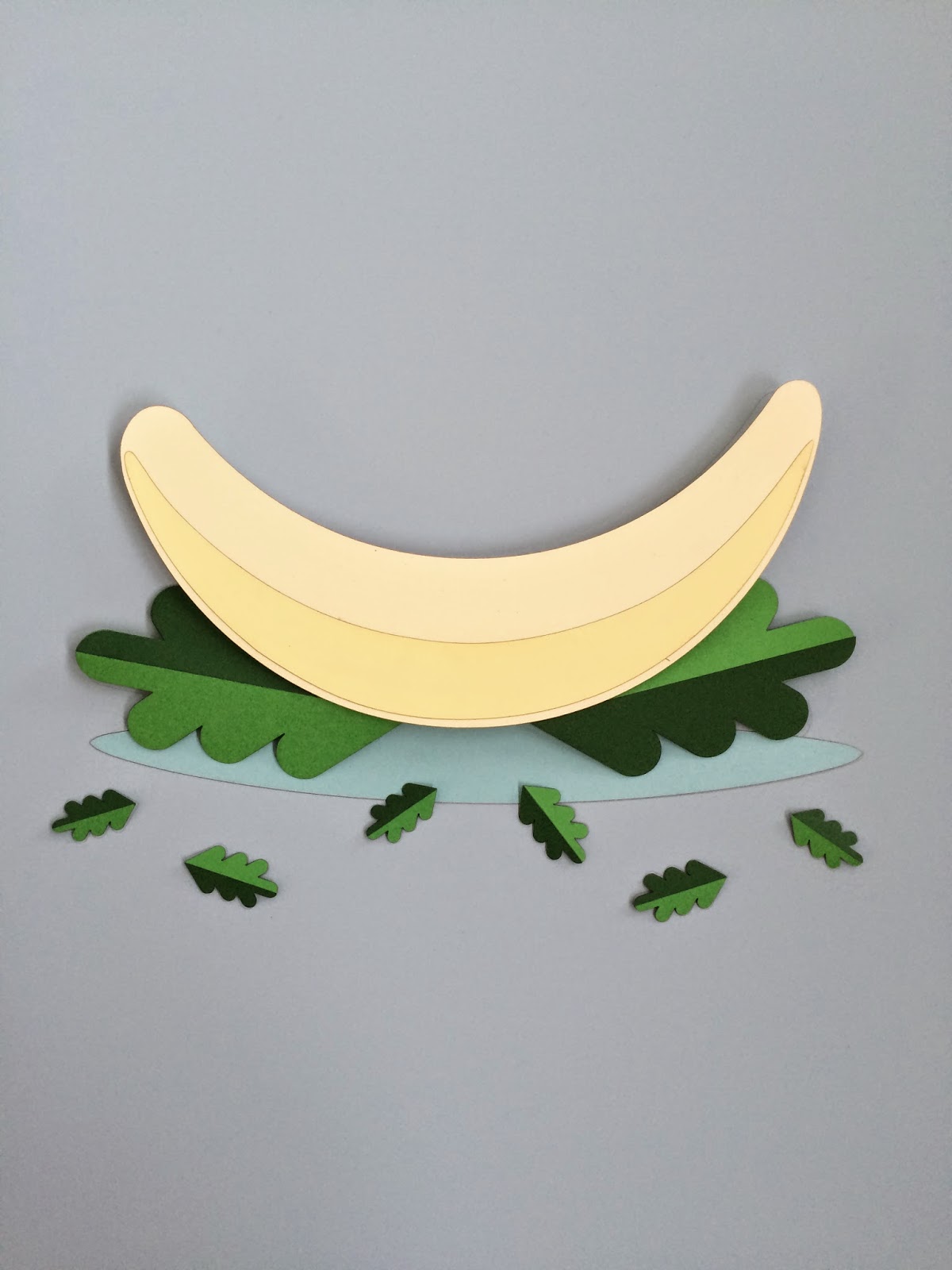
It took a lot of adjustment to create the banana shape but I got there in the end. I decided to keep it simple so it ties in with the brand guidelines.
Each shape will be different shades of card so it will create texture and give the image depth.
I had the idea of scoring the banana in the middle and folding it so it looks 3d and will create some nice shadows when photographed. This lead on to doing the same with the banana skin but folding half of it back. This will work on the second poster.
I experimented with folding shapes for the ice cream to give some texture. It was really fiddly and hard to get nice crisp folds so I'm not sure it will work.
I sent what I had done to Dan and he started illustrating the rest of the elements.
He designed some poster variations and sent the file back to me so I could try to develop it further.
Me and Dan discussed the idea of creating a landscape or scenery behind the banana so we could add more detail to the image.
I had an idea to create a banana tree to use behind the banana so it shows it in the environment.
In the guidelines it states the logo must have space equal to the O in the logo so I have kept the illustration clear of this.
I tried adding some larger leafs at the bottom of the image to give some perspective.
After talking Dan he pointed out that the second poster has to much going on and could do with simplifying as its meant to represent the banana peeling as the main focus.
Next i started working on the final poster. I changed a few things dan had done such as making the sprinkles rounded instead of square. This is closer the styles they gibe in the guidelines.
I wanted to highlight the wonders sections with sprinkles so it reinforces the strapline and concept. I also tried changing the background colour as I realised in the guidelines that the brighter colours are primary colours and the paler pastel colours are secondary, so it made sense to use the lighter for background.
The second poster works much better simplified and striped back.
I have changed the background colours to make the posters different and work more as a set. This also allows for the logo to be used in the paring colours which stands out well.
Dans illustration of the bowl had sharp edges so I have rounded them off so it works better with the overall style of illustration.
Now we have the posters in digital form, the next thing to do was to separate the posters into shapes in relation to the correct coloured card. I have made multiple shapes so we have some spares incase anything goes wrong when we come to construct the image.
Next we had to laser cut each shape out. Everything went ok in terms of cutting, however, the laser cutter has burnt the underside of the card which is not a problem, but it meant it has left smudges on the front. This is not ideal so we will have to edit the images once they are photographed.
We had a test run at home to make sure all the pieces were there and to score and fold sections so they are ready to assemble.
The banana was difficult to fold so we think we might make the skin curled instead of harsh folds.
The leafs were simple to make, they just needed folding and the dark section glued on top.
Production:
Now we have everything ready, we have made a start on putting the posters together.
It wasn't as difficult as I was expecting, the only thing we needed to think about was the layering of elements, we had to work out what needed to be on what level, and to do this we have used strips of mount board to raise elements.
Above is all the paper elements ready and in place for photographing. I have glued some section in place and other are placed so its easier and can be adjusted if needed.
I finished glueing the smaller leaves for the second poster and Dan re-cut the banana skin. He managed to get the peel nice and curved which I think looks really good.
We decided not to bother sticking down the final poster as we want to be able to adjust the arrangement. All the elements for the posters are ready for photographing which will take place on Friday.
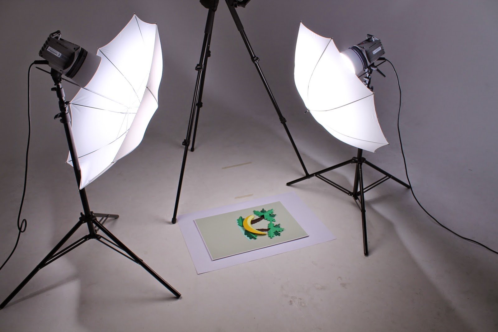
Today we photographed the work. I was surprised at how smoothly the whole process went as I usually want to smash the camera up by the end. I think we got some good shots that will work well once edited.
Edited Photos:
We have edited the photos above and they will be used in the boards that we submit to show the process and journey of the project.
Posters Digital Development:
Although we printed the background images we felt it wasn't bright enough so decided to cut around the images and use the background colour digitally.
Once we had edited the images we transferred them over to illustrator to add the final pieces.
I made the images go up in order of size to reinforce the concept and show they are part of a set.
I showed Dan what I had done and he liked it but suggested to make the text white and to apply a radial gradient to make the centre of the image stand out more. I think this works really well and creates some depth and focus on the illustrations.
We are both really pleased with the designs so far, we have decided to have a break from it for a day and come back to it on Monday with fresh eyes and to see if we think anything can be improved. This gives us four days to get the boards looking good for the submission deadline which is on Thursday.