Brief 1:
Create a vinyl cover from the email below.
"we're gonna be releasing a limited edition edition 12" of a mix evian christ made last year called dug-3...
We were discussing artwork concepts and Josh wondered if there was any way you could graphically represent the 10hz tapping sound that makes up the duga-3 transmission?
Important to mention right now is that we don't have a lot of time to do this, as this release is intended for record store day and they have super tight deadlines, so we need this by the end of today?
DIMENSIONS 12" X 12"
Duga-3 Transmission:
My first thought after listening to the mix and the duga-3 transmission were to create something that represents repetition and sound waves. I wanted to create a collage so I used photoshop to experiment with images. I didn't want to create a hand made collage because I didn't think it would be time effective seeing as we had a limited time frame.
Sourced Images:
These are some images I looked at to get some ideas and used a couple in the designs.
Idea1:
Idea2:
Idea3:
Idea4:
Final Design:
Once we had come up with four designs each we decided this design was the strongest and decided to use this for the final design. I enjoyed making this but found it difficult to get going at the start. It was good to see how fast I could work when working to tight deadline.
Brief 2:
Create a poster from the email below.
Hey new poster please
ODONIS ODONIS
+Guests
weds 18th April
Kraak Gallery
www.ticketline.co.uk
www.seetickets.com
www.wegottickets.com
Piccadilly Records
Oh! Please have saint coltrane as support
Dimensions: A3
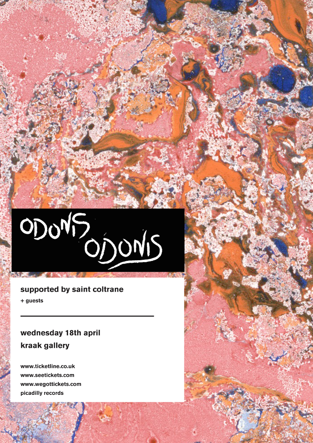
I had a quick look at the band to see what style of music they play and its quite alternative and heavy so I wanted o reflect this in the design.
I started by creating a hand drawn font for the band title, I made this using the brush tool in illustrator.
I found this brief quite hard because I don't usually design things in this "post modern" style so it was good to try and think of a design that would appeal to the target audience instead of my own taste. However, after some comparison we decided Bobby's poster was better and had more impact so we used his for the final design.
To create some contrast we decided use my hand drawn title with the sans-serif type to give a some texture and break up the information.
Final Poster Design


No comments:
Post a Comment