The client wanted the logo to use the specified colours and it needs to translate onto black background. I have been looking at different tech related logo to get some inspiration.
I like how this logo uses the colours with juice splashes in the form of a phone. The logo above all use phones in them so I want to avoid this as its really obvious and over done.
I like how these logos use grpahics with the letterforms to create the logo.
I like the flat design of the logo above. Some of the other examples i have looked at use highlights to create textured logos so I will need to experiment with both techniques to see which is most appropriate.
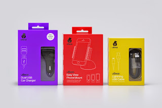
Although I'm not designing the packaging i had a quick look at some examples to see whats about and current. It seems to be the higher end brand use modern simplistic designs with vivid colours and the cheaper brands are more dated with gradients and static colours.
I have been looking at objects associated with power and dripping liquids to see if I can take any ideas from the forms.


.JPG)


No comments:
Post a Comment