Brief:

I wanted to do this brief because I thought it would be a short, quick turn around brief to get me back into designing before I start some of the more substantial briefs. I will give myself two days to complete the brief.
Song / Lyric:
99 problems but a bitch aint one / JayZ
After doing some research I think I am going to create a crest/ badge to represent a k-9 response unit as this is one of the most iconic lines in the song and JayZ is referring to a police dog when he says "bitch"
Initial Sketches / Ideas

I have sketched a few rough ideas to get me going before I develop it digitally as this is how I prefer to work. I am going experiment with line and shape to create the illustration.
Digital Development:

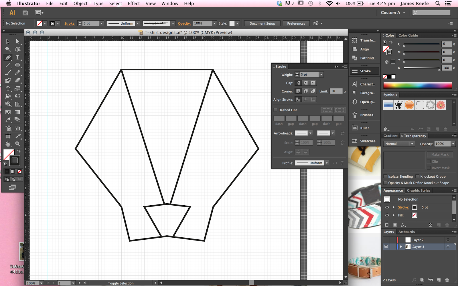


I started by creating the dogs head with lines, Im sure wether to leave it as outlines or experiment with filling in sections. I think because its for a hip hop song the clean lines may need to be more ragged to suit the grittiness associated with hip hop.


I tried using a circular badge to frame the design. I think I am gong to have some type saying New Jersey as thats the police force talked about in the song.


I decided to move on and try filling in some areas with block colour, I think this works better than the outline because it has more visual impact. I changed the style of badge to a more angular shape to work with the sharpness of the dog. I have chafed the stroke to a more grungy brush, I think is works better and suits the song better.


Next I tried it without the badge and added 99 stars to represent the problems. I have added another colour to the design, i think this works well and breaks it up better, it also makes it more clear that its meant to be a dog as I thought it looked a bit like a fox.


I wanted to try and some detail inside of the badge but I think it doesn't needs it after some reflection, I think it looses impact and looks a bit tacky.


After receiving some feedback from my peers, it was pretty even opinions between the two designs so I am going to stick with my initial thoughts and use the design on the left as I think this will work best on a T-shirt.
Final Design

No comments:
Post a Comment