The logo can be used on its own or with the strapline like above.


This is the kind of illustration that moo usually use so we will need to consider this when we illustrate our design. Its needs to be simple and quirky.


I have ordered a selection of coloured card, this should give us the option to use a variety of colours in the design.

I saw this image and it gave me the idea to create a poster series that can work separately and together when layered.


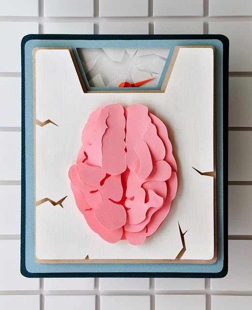
I then came across this these images which made us think we could create the images out of paper so we could create a 3d image. We both discussed this idea and decided to go ahead with it.


Once we had a concept I started looking image of bananas to see how I could illustrate one.


For the final poster we are creating an illustration of a banana split. The image above is the kind of thing I was picturing.

I found this image above which kind of uses the same way we were thinking. The layering of the shapes creates depth and will create some nice shadows when lit up. We will need to photograph the images well to get the full affect.


I was looking at different ways of how we could illustrate the designs.


This pineapple image may be flat but the way it has been illustrated is relevant as it uses geometric shapes to create the features. This would be practical for us as it will be easier the construct the image as we can fold it in half to extrude of the page.

No comments:
Post a Comment