To start off my group split up and started looking at some existing examples of branding and city branding.


The idea of connecting elements or a logo that can be split up to represent each city then combined is interesting. This is something I have been thinking about as a possible solution.


The identity needs to be attention grabbing and be able to be applied to a range of media.


I like the idea of using symbols to represent each city. This will allow us to create a visual language that can be applied to different mediums.


I think a strong strap line is need to needed to make the audience feel apart of the brand.

I think we should think about created a moving logo as this was mentioned in the brief.


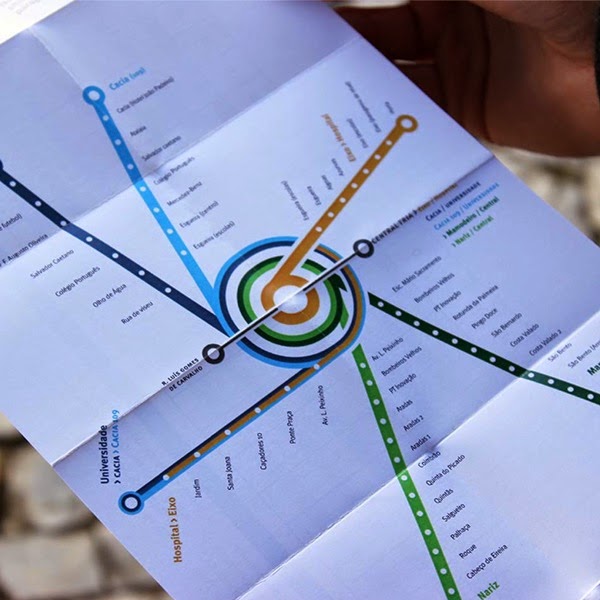
We want to create something like above to represent the connections between the cities and the opportunity for growth and expansion.


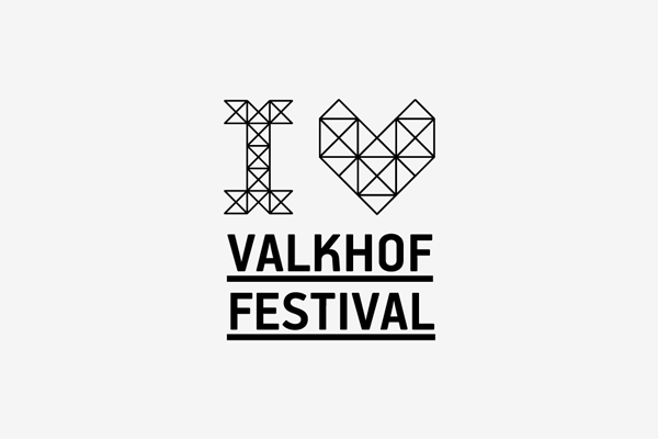
I really like the colours in these designs as there fresh and current. I think they need to be vibrant to draw attention.


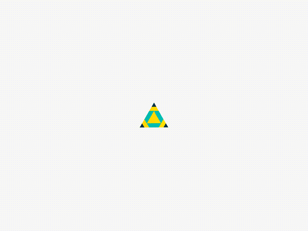
I like the simplicity of this logo, it has lots of impact.


These are some good examples of how we could apply the design to aspects of the city. We have also discussed the idea of creating a sculpture that could be displayed in the city centres like the Amsterdam typography.


I came across this image and it gave me the idea to create the logo out of four shapes that can be connected. Each shape would represent the cities and we could create a sculpture out of them and photograph it.
No comments:
Post a Comment