This brief will be to brand a cream soda company that sells pre-mixed alcoholic cocktails with cream soda as the main ingredient.
Initial Ideas:


Logo Design:

I have taken inspiration from retro bottle caps that I have looked at in my research. I want it to look hand made and weathered.
Digital Development:


I want to use a T for the main visual of the logo. I have been experimenting with 3d style type.


A lot of the bottle caps I looked at use circular boarders so I have tried this out. I like how it looks and think it suits the brand so I will use it in my design.


I wanted a bold font so I have used beubas Neue and applied a brush stoke to make it looked hand printed. To make the logo weathered I have added some noise to give a letterpress effect.


In my sketches I tried making a hand drawn font but I don't think it works as well as the T. It was really hard to make it look right digitally so I am going to leave this.


I tried reversing the logo and stripping it back but I think it loses some of the impact.


Final Logo:

I tweaked the logo a bit and simplified the T which I think works much better.
Bottle Design:

I found these coloured glass bottles online that I will be using for the flavour range.
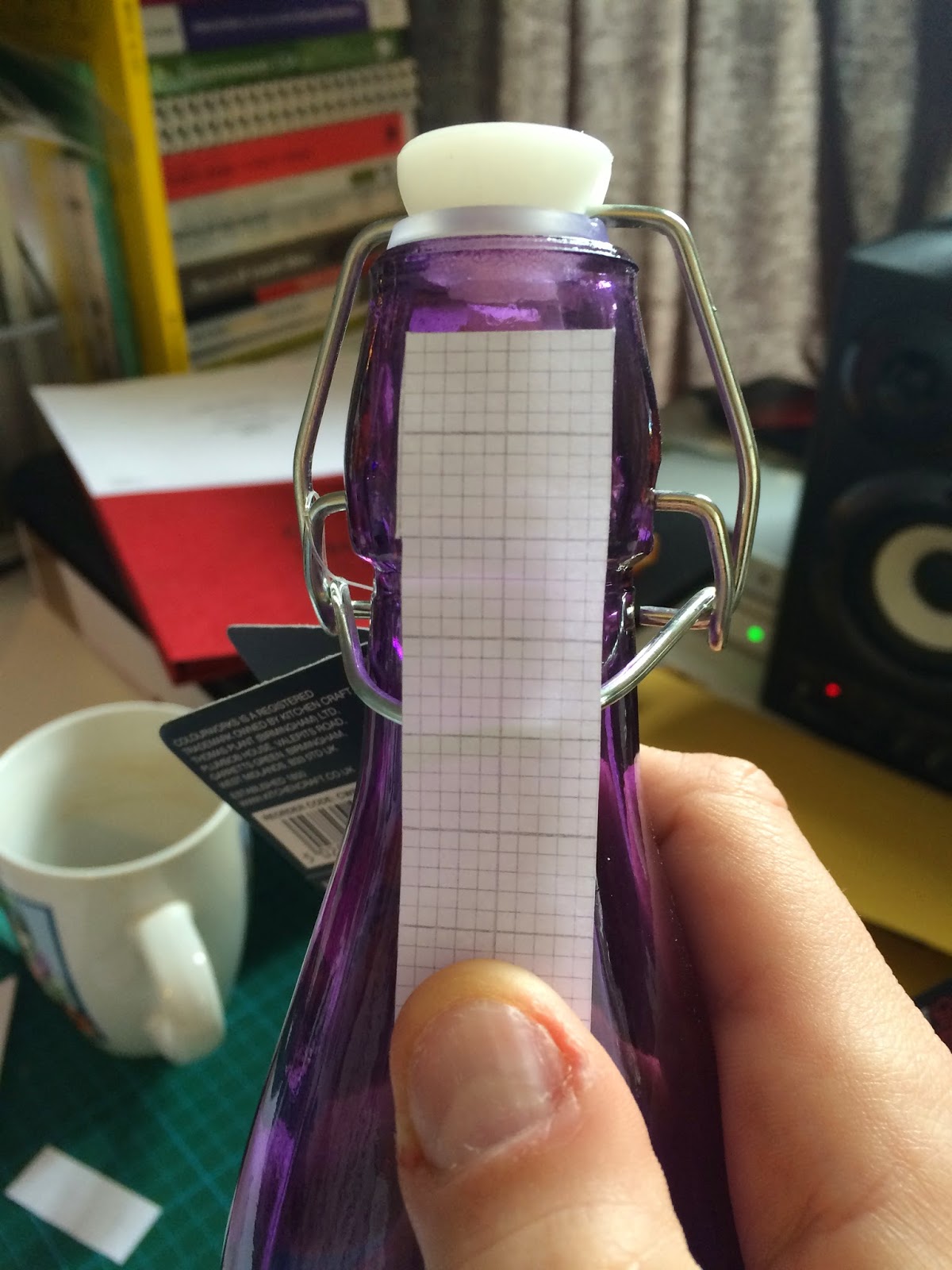

The left image is the net for the neck tag. This is needed so the drink can be sealed so no one can tamper with it. The right will be the rough area for the bottle design. I am thinking of using vinyl for the design instead of a label as I felt it was more appropriate and makes the bottles more unique.


For the bottle design I have based it on road signs from the 1920s. I will be using the tag line 'Oh My! What a Tasty Beverage' Wanted the bottle design to be something different instead of just putting the logo and the bottle.


I started off by making the shapes for the design. I had to think of the design in negative space as it will be cut out of vinyl.


I started to add some detail and choose fonts. I wanted each font to be different and I have chosen fonts that have been informed by the images in my research.


For the tasty font I have created my own to relate to the T in the logo.


I have added some detail to the background of the design to give it some shape so it looks like a bottle label.


I will be using white vinyl for the labels so it will look like the right image once cut out. I am a little worried that it won't cut out as its quite detailed so I am hoping for the best. If it doesn't work then I will have to use clear acetate or something similar.

I tried cutting out the vinyl and it seemed to work ok. Now I need to pick out the detail and apply transfer paper ready to add to the bottle.


The first bottle went not to bad, I managed to apply the vinyl pretty level and front on.


Neck Label:

I have used the same texture as in the logo for the neck tag. I want it look worn and I will use antique white stock to print on.


Bottle Tag:

For the bottle tag I am using the coloured stock above.This will communicate the flavours and compliment the bottle colours. The designs will be printed in black.
Front:


The label will be printed double sided. The front has the logo and the flavour name.
Back:


The back of the label had the ingredients, the alcohol percentage and the bar code. This will be tied to the metal lever on the neck.


The photographs went really well, probably the best Ive ever done. I managed to get the lights just right and i filled the bottles up with lemonade which created a coloured shadow effect which I think looks really good. I just need to edit the photos now Then I can start to create the other material.
I have tried the neck tag but I think it doesn't work cause the black ink clashed with the white vinyl so I will just use the tags. I have rounded the corners as well to make it look less hand made.


I tried a few things out for the advertisements but it wasn't working so I decided to start again and create the background that reflect the fruit in the drinks.

Fruitylishious will represent watermelon.


Final poster series above. I am happy with these now and I think they work well as a set. I have tired to represent flavours in the designs whilst keeping it fairly simple as the bottle design is busy.


Above is to show how it would translate on a digital output


The three examples above are the designs in the intended environments.
No comments:
Post a Comment